Home
Contact Centres Hosted Contact Centre Predictive Dialler CRM Integration Reporting Live TPS Checking
Voice SIP Trunking VoIP Hosted PBX Hosted Asterisk
Data Connectivity AI Solutions
About About Blue Telecoms Accreditations Reviews Blog Support
Get in Touch
Reporting & Analytics

Contact Rate Heatmap — Know the Best Times to Call

Visual heatmaps showing contact rates and conversion rates by hour and day of week. See exactly when customers are most likely to answer — and most likely to buy — so you can schedule dialling for maximum impact.

Request a Demo ← Back to Reporting
contact rate heatmap, best time to call, hourly contact rate, conversion rate by day, calling time optimisation
Feature

Colour-coded insight into when to dial

The contact rate heatmap analyses your historical calling data and displays contact rates and conversion rates in a colour-coded grid — hour by hour, day by day. Dark green cells mean high contact rates; red means low. The pattern tells you exactly when your customers are reachable.

📞

Contact Rate by Hour

See what percentage of calls reach a live person for every hour of the day, for each day of the week. Instantly identify the golden hours when customers are most likely to pick up.

Benefit: Concentrate dialling during peak contact hours for more conversations per agent, per hour.

🎯

Conversion Rate Overlay

Contact rate alone doesn't tell the whole story. The heatmap overlays conversion rates so you can see when customers don't just answer — but actually buy. High contact plus high conversion = your sweet spot.

Benefit: Dial when customers are both reachable and receptive — maximise revenue, not just call volume.

📊

Campaign-Specific Views

Different campaigns reach different audiences with different habits. View heatmaps per campaign to discover that your B2B campaign connects best at 10am while your B2C campaign peaks at 6pm.

Benefit: Optimise dialling schedules per campaign — not a one-size-fits-all approach.

📈

Trend Over Time

Compare heatmaps across different time periods to see if contact patterns are shifting. Seasonal changes, market trends, and campaign maturity all affect when customers answer — the heatmap tracks these shifts.

Benefit: Adapt your dialling strategy as patterns evolve — stay ahead of changing customer behaviour.

Action

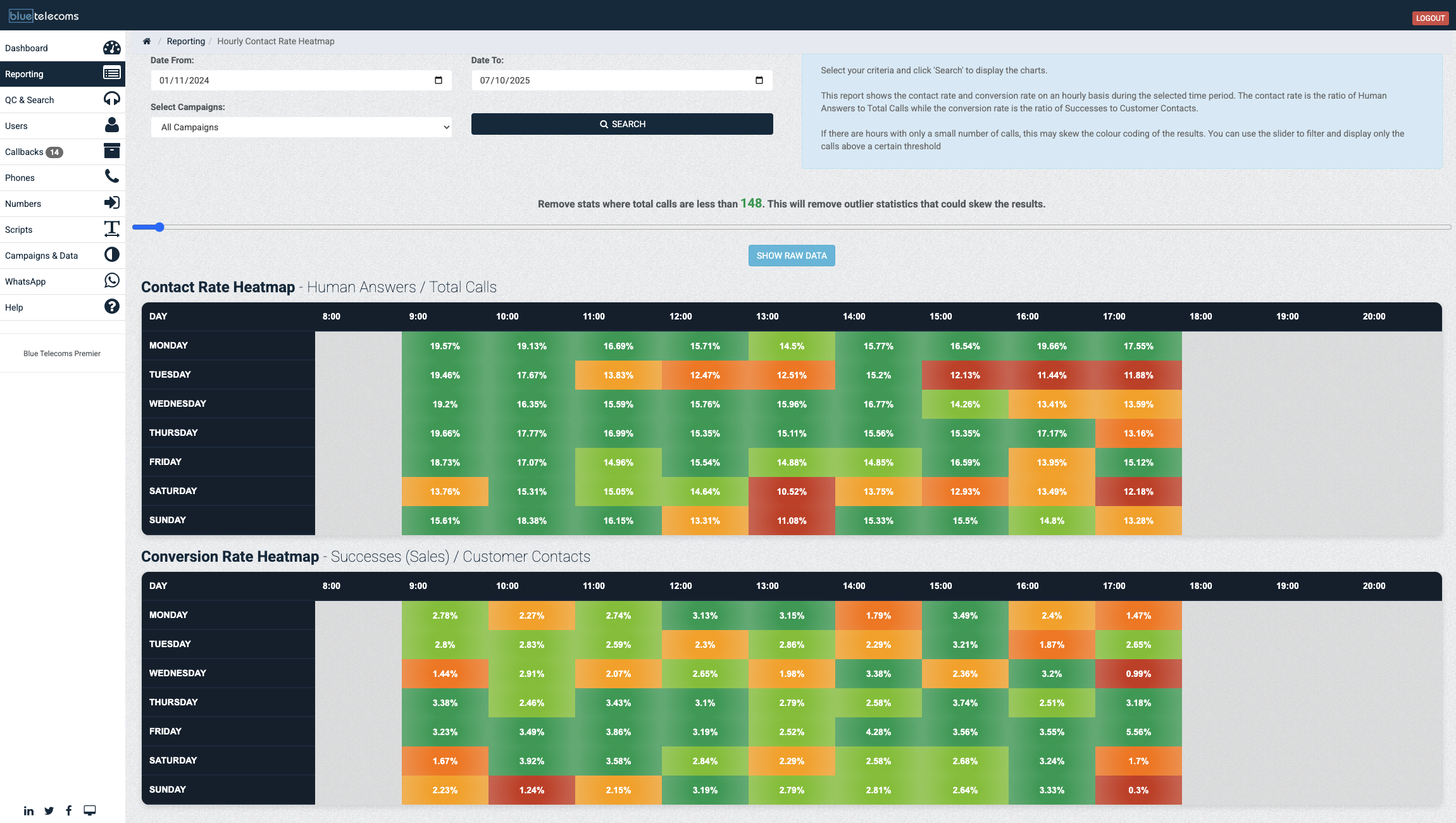
How the contact rate heatmap works

The platform analyses your historical call data and builds the heatmap automatically. Every call outcome is categorised and plotted by hour and day to create a clear visual pattern of when your customers are most reachable.

  • Automatic analysis — Built from your actual call data. No manual input required — the heatmap updates as more data flows in.
  • Colour-coded grid — Green = high contact/conversion, red = low. The pattern is visible at a glance.
  • Filter by campaign — View heatmaps for individual campaigns or across the entire operation.
  • Date range selection — Analyse the last week, last month, or a custom period. Compare different time ranges to spot trends.
  • Exportable — Download heatmap data for presentations, client reports, or workforce planning meetings.
Blue Telecoms contact rate and conversion rate heatmap showing optimal calling times by day and hour
Benefit

Dial smarter, not harder

Every contact centre has dead hours — times when agents are dialling hard but barely connecting. The contact rate heatmap reveals those dead hours and shows you where the golden hours are. The impact is immediate and measurable.

When you shift dialling activity from low-contact periods to high-contact windows, agents spend more time talking and less time listening to ring tones. More conversations per hour means more opportunities to convert. More conversions per shift means more revenue per agent.

Combined with conversion rate data, the heatmap doesn't just tell you when people answer — it tells you when they buy. That's the difference between dialling efficiently and dialling profitably.

🗺️

Optimised Dialling

Right time. Right day. Maximum results.

Best hour 10:00–11:00
Best day Tuesday
Peak contact rate 34%
Peak conversion 12.1%
More Reporting Features

Explore more reporting & analytics

📊Real-Time Wallboards 👥Team Stats Dashboard 💰Floor Sales Tracking 📉Drop Rate Monitoring 📋Custom Report Builder 📤Automated Exports

Discover your best calling windows

Request a demo and see how the contact rate heatmap reveals exactly when to dial for maximum connections and conversions.

Request a Demo ← All Reporting Features